Make It Make Sense is a personal editorial newsletter created for creators, marketers, and ambitious professionals seeking clarity in the modern internet, creator economy, and evolving career landscape.
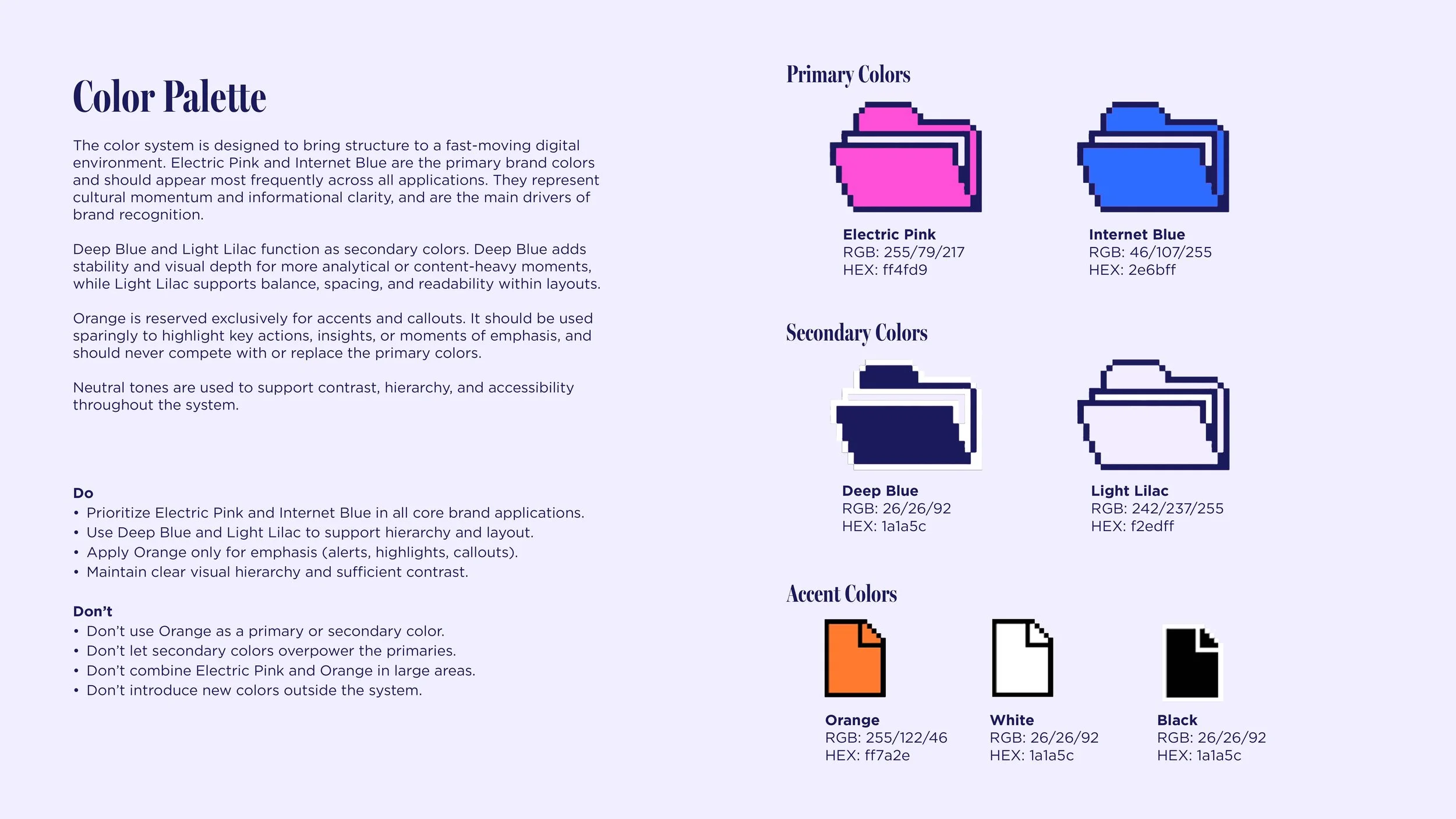
I was tasked with developing a logo and brand system built around the idea of “Internet Archaeology”—a visual exploration of the web’s past to help decode its present. This project was an absolute joy to create. It gave me room to think conceptually, experiment with subtle digital references, and build a system that feels both intelligent and self-aware. The client loved the outcome and fully embraced the direction.
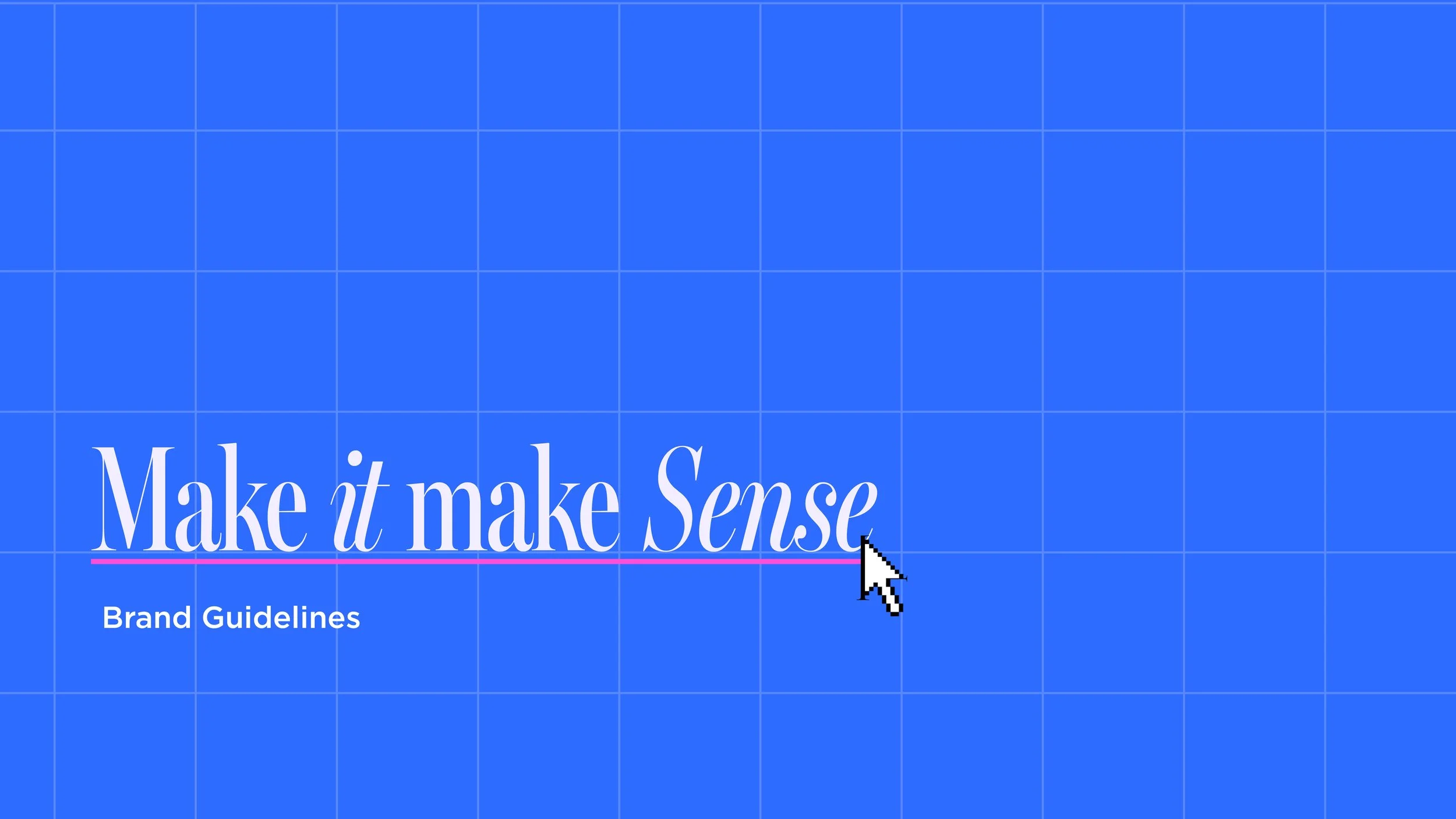
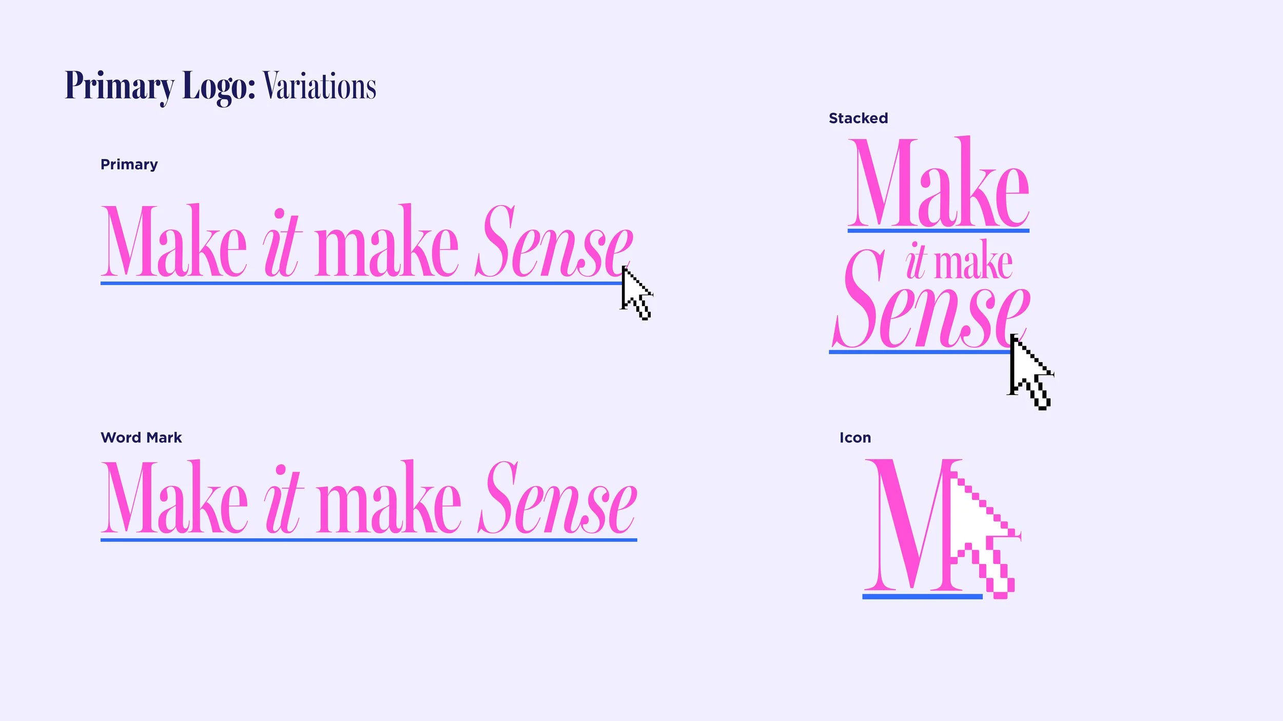
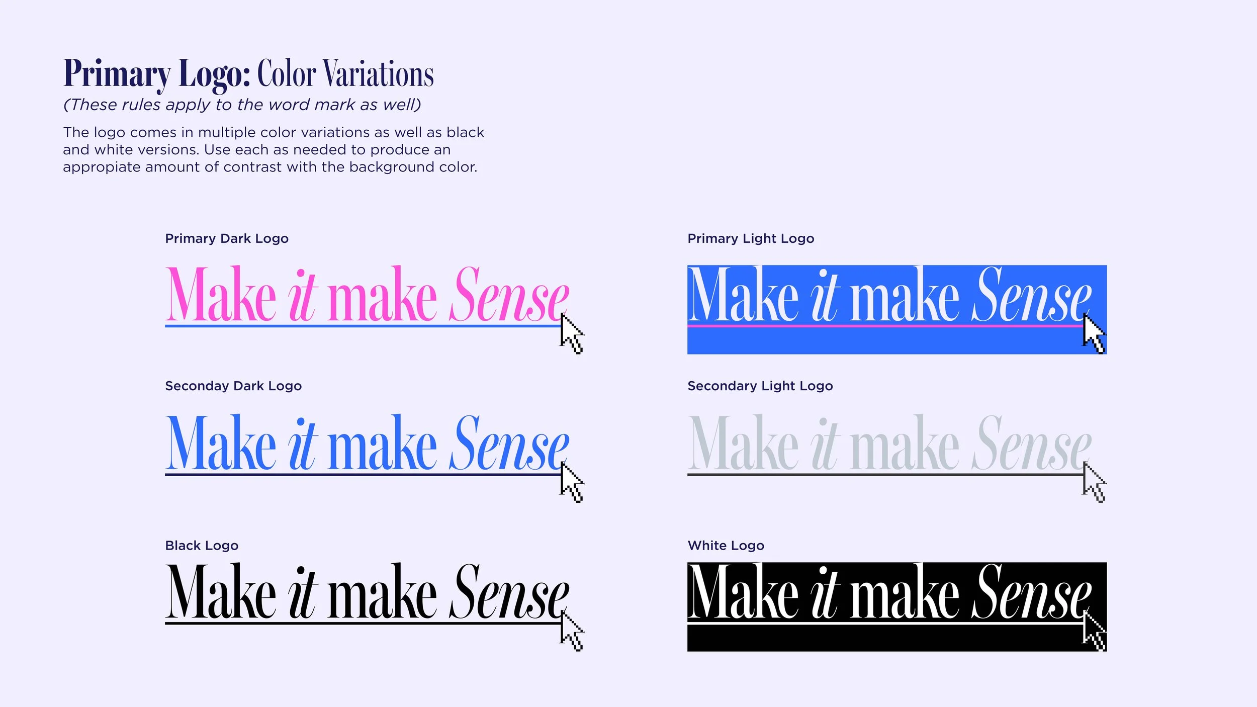
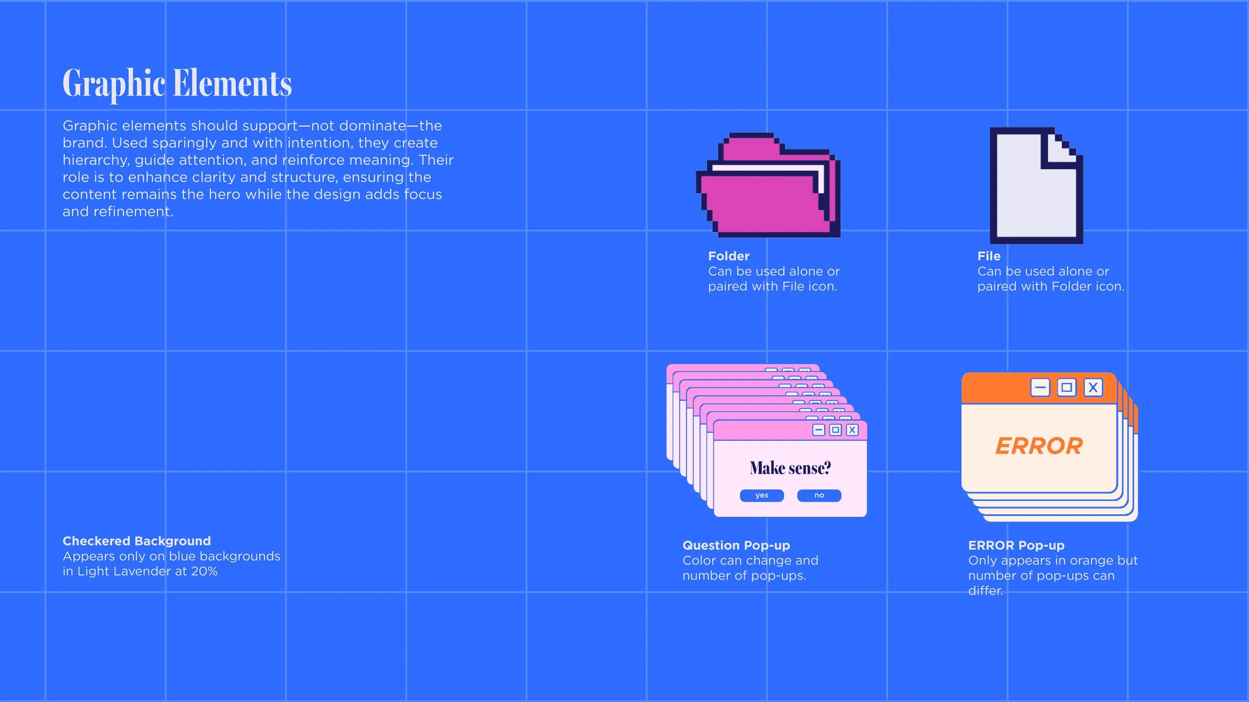
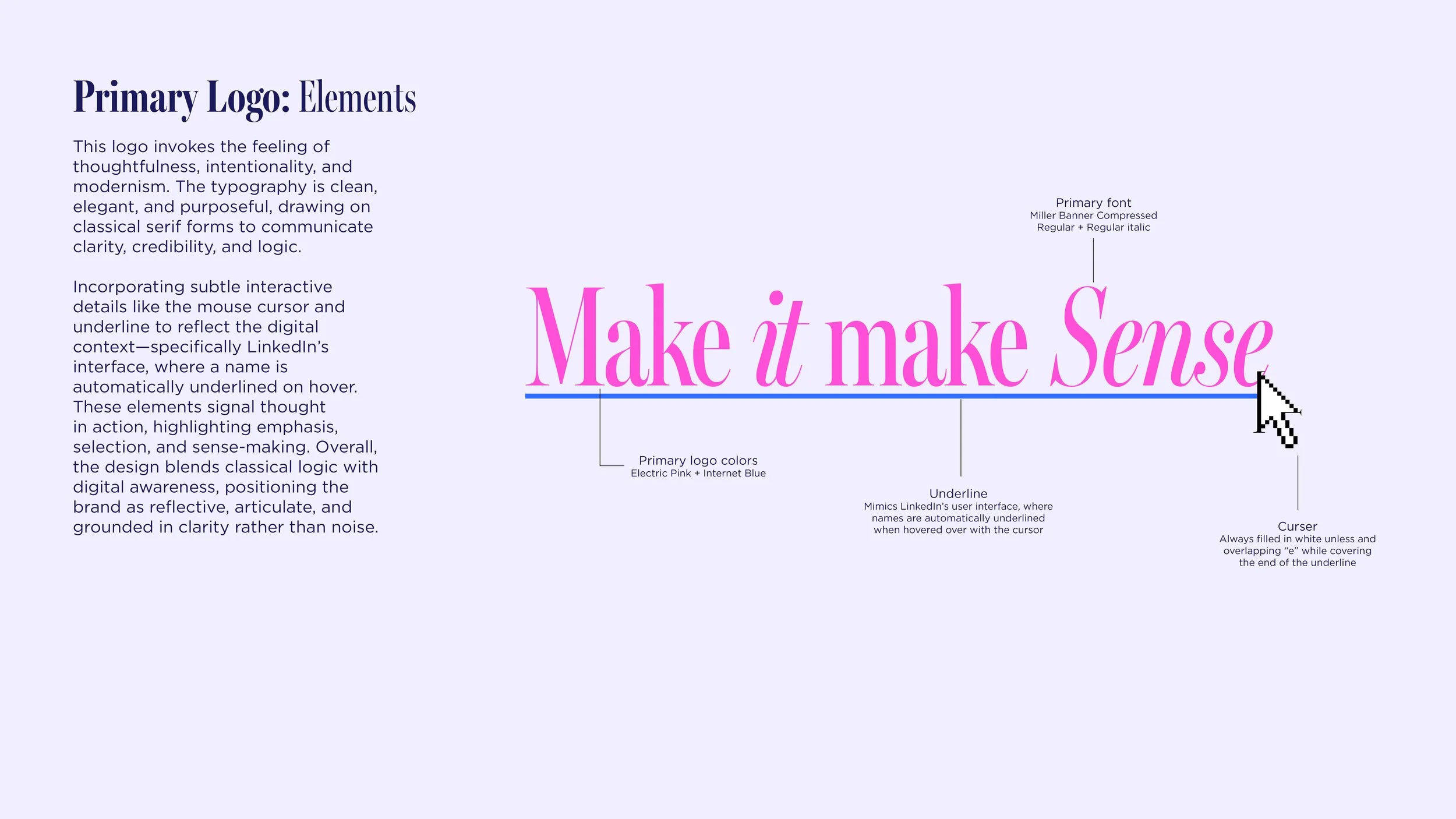
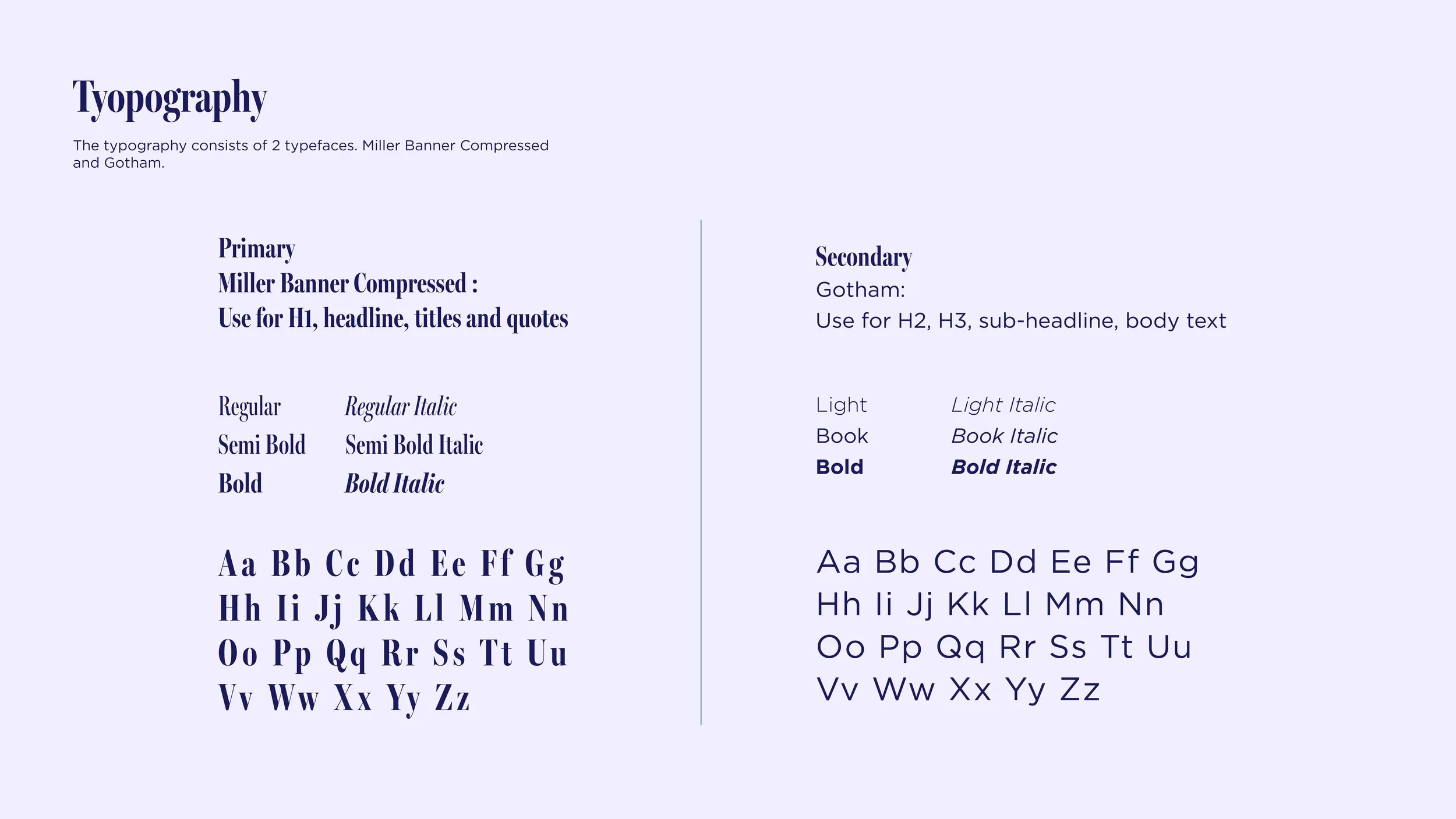
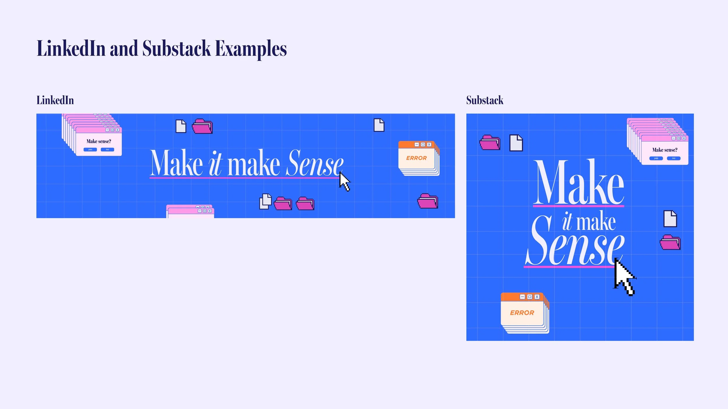
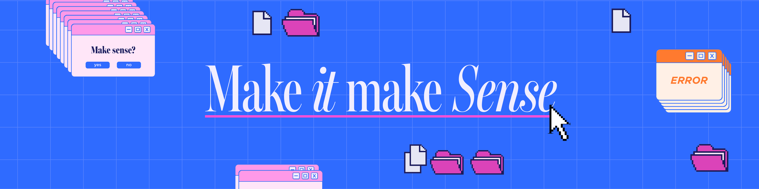
The logo evokes thoughtfulness, intentionality, and modernism. Clean, elegant serif typography communicates clarity, credibility, and logic, grounding the brand in an editorial sensibility. I incorporated subtle interactive cues—like a mouse cursor and underline—to reflect the digital environments the audience inhabits, referencing interface behaviors familiar from platforms like LinkedIn. These details suggest thought in motion: emphasis, selection, and sense-making.
The result is a brand that blends classical structure with digital fluency—reflective, articulate, and grounded in clarity rather than noise.